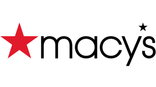
American department store Macy's is the latest brand to usher in a logo redesign that's so subtle you might not have noticed it. The new logo, above, sees the lettering made bolder and its tracking loosened up. Meanwhile the red star graphic is neatly lined up with the x-height of the brand name. But the absence of overshoots in the lettering's curves is a major type design error.
Our guide to logo design has highlighted the importance of typography when it comes to creating a brand identity, so we can see keen-eyed typographers getting irked by this oversight.
If you're not familiar with an overshoot, it's the degree by which a round or pointed letter extends higher or lower than a comparably sized flat letter. So basically, keeping overshoots in mind allows your letters to look like they're the same size. In the case of the new Macy's logo, the stem on the letter 'a' is the same height as the bowl, which is a pretty big type design no-no.
It's a flaw your average Macy's shopper might not notice. And it's a shame because all of the other type and graphic design elements appear to be an improvement on the old logo, below. The new logo's move to align the red star with the lettering gets a thumbs up from us, and the tweaked tracking gives the brand name more room to breathe.

But as it is, Macy's joins the likes of Ikea and McCafé, both of which have rolled out subtle logo designs that are so subtle you might have missed them.
Macy's isn't the only retailer that has benefitted (overall) from a fairly subtle type design refresh, either. Luxury department store Nordstrom recently unveiled a new type based logo, which has a dynamic contrast between its condensed letters and its circular 'o's. It's got a sleek and sharp elegance to it that does a good job of signifying that Nordstrom is a luxurious brand to be respected. See how it compares with the old Nordstrom logo by clicking through the gallery, below.
As for Macy's, its new logo has already started rolling out online, and will appear across its approximately 680 department stores.
Related articles: